Some of you have already seen the interior of Wildheart, my 20 ft. 1996 Thor Prism travel trailer, as it looked when delivered in early January. For those who haven’t, and may be curious, I’m posting some relevant photos here.
[ngg_images source=”galleries” container_ids=”1″ display_type=”photocrati-nextgen_basic_thumbnails” override_thumbnail_settings=”0″ thumbnail_width=”240″ thumbnail_height=”160″ thumbnail_crop=”1″ images_per_page=”20″ number_of_columns=”0″ ajax_pagination=”0″ show_all_in_lightbox=”0″ use_imagebrowser_effect=”0″ show_slideshow_link=”1″ slideshow_link_text=”[Show slideshow]” order_by=”filename” order_direction=”ASC” returns=”included” maximum_entity_count=”500″]I’m not a pale blue kind of gal. In fact, I’m not pale anything when it comes to color, if you haven’t yet figured that out. So I’ll be renovating the interior with these five main efforts:
- Adding a faux tile backsplash. “Faux” because I don’t have the time or money to do real tile (yes, I have tiled before), and it would also add too much weight to the trailer for me to stay safe and legal.
- Painting the medium-dark faux wood of the cabinets. Once again, the original “woodwork” of the cabinetry is a middling oak color, neither really light nor dark, and —to me—offensive for that noncomittal characteristic. So I’m going to paint them an antique white. I don’t want the starkness or sterility of a bright white, but I want to lighten up the interior, which is really important in such a small space.
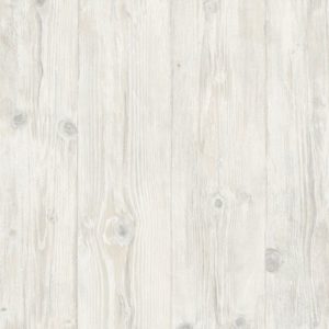
 Re-covering the walls with wallpaper. I’ve chosen a pattern that resembles sun-bleached wood that looks kind of like shiplap (I share that preference with Joanna Gaines of HGTV’s “Fixer Upper” show), except the boards run vertically instead of horizontally. It will also help significantly lighten up the interior. I got mine from Wayfair.com.
 Replacing the awful ’80s print curtains. Right now, it looks like a desperately decorated dental office. I’ve opted for a Southwest design theme, both because I’ve always liked the Native American motifs and bright, saturated colors of that region, and because I’ll be spending significant time in that part of the country in the winters. I got this from Fabric.com, and it was easy to do: Just basically take down one of your existing curtains, lay it out flat and measure. Remember to allow about an inch on all edges for hem, and remember that gathering on a curtain rod means you’ll use more fabric than you probably thought.
- Replacing the awful ’80s print material used on the dinette cushions and beds. Though different from the curtain material, the cushion upholstery has an equally sad vibe, like a past-his-prime bachelor hitting on all the single gals at Ladies Night. This may be the last renovation I make from this plan, both because it will be the most expensive and time-consuming, and because once I turn the dinette into my office, the cushions will mostly be hidden from view and so won’t be as visually offensive as they are to me now. Not sure where I’ll find the print I like, but I’ll start my search at Joann.

I enjoyed seing the pictures. It looks cute; and I think your choice of Natve Anerican-style materials is going to be vibrant but homey touch 🙂
Painting the cabinets is going to make the space feel larger, too.
That’s the plan, thanks!
I am so thrilled for you! I have spent a lot of time and energy looking into doing this, but it is not my time. I am thrilled that you are doing it.
Cathi, thanks for your support, and I will return the favor when it IS your time. And your time is coming…